
With just mere seconds to capture the attention of any given visitor on your site, you want to put your very best foot forward when it comes to presenting your lead magnet offer. No pressure or anything, but have you objectively reviewed your landing page from a user experience perspective? Would you be interested in sticking around?
Some explanation on lead magnets: A lead magnet is a free offer to your website’s visitor, in exchange for their email address. A lead is a potential customer, or prospect, who has indicated that they are likely your target audience because they have shown interest in your content. A magnet, as the name suggests, is a tool that will attract those visitors – usually something perceived as valuable that’s given away for free.
In a funnel, you’ll notice that a lead magnet is most often the first step. It should be an integral part of your funnel strategy to have a way of capturing email addresses and triggering an automated email sequence, and that’s precisely where the lead magnet comes in.
Here’s a list of some lead magnet examples:
- Assessments
- Catalogs
- Cheat sheets
- Checklists
- Demo videos
- Discount codes
- Guides
- Recipes
- Reports
- Resource list
- Swipe files
- Templates
- Tutorials
- Webinars
(But you can read this guest blog for more top lead magnet examples and how to create the best lead magnets for your business.)
The trick is, lead magnets are not nearly as clever of a tactic as they once were. People are also highly skeptical of too-good-sounding “free” offers that always come with a pitch attached. Nonetheless, people still want a curated, easy-to-reference source and will exchange their contact information for it. In other words, your lead magnet definitely still stands a chance and it’s worth it for you to have one on your website.
In other words, don’t just give up on it because your download rate has been underwhelming, especially so if in contrast to your page visitors. If you don’t offer anything to potential customers when they land on your page, there’s a good chance you’ll be letting money walk out the door because they might never try your products at all.
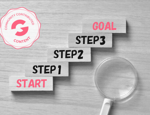
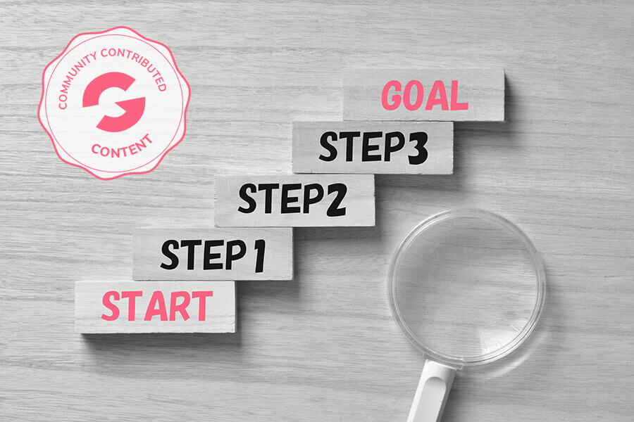
So, you want everyone to feel compelled to take action and not just click off immediately. Luckily, there are seven proven tactics that you can apply today to help you increase your opt-in conversion rate, discussed below.
You really don’t need to be a professional designer or hire out the job to fix this up, it is something that you can do on a tight budget and then also continuously test and tweak yourself. Just remember that whatever you offer for free, must be perceived as valuable – even though it’s free. Hard balance, but again, think of it from a user’s perspective. But speaking of free, that leads us to the first tip:
1. Add “Free” to Your Copy
Here are some of the suggested places to include “free” on your website:
- Call to action (CTA) buttons
- Landing page copy
- Navigation
- Headlines
- Email subject lines
- Email body copy
- Headings
- Ads
Just by adding in that one word in a CTA button, you can more than double opt-in rates with even a simple adjustment such as changing it from “Download Now” to “Download for Free”. And while we love some fun and unique copy, don’t get too creative on the CTA button or link.
2. Use High-Contrast Colors for the CTA
There are design tips that can make your CTA stand out from the other elements on the page and grab attention, including using a color that is not predominantly used elsewhere on the page. Contrasting colors make your CTA more clickable because it is instantly recognizable.
You should also make the CTA large, with ample spacing around it, to make it clear and avoid confusion. Yes, even if you think it’s obvious, make sure that it actually is.
3. Create Pop Ups
Who can blame someone for giving it one last try with a pop up? You can make use of different kinds of pop ups, although the exit pop up is most often recommended. The intention being that you have one final chance to present your offer when the visitor is about to navigate away from your site without having taken action.
It’s a proven tactic and creates urgency that will encourage visitors to take action and click the CTA, so you want visitors to feel as if they will be missing out if they don’t – be it through discount coupons, a quiz, a freebie, etc. Keep that direct benefit front of mind when writing the copy for your pop up, as it has to have enticing statements and field any predictable objections. When selecting the timing of the trigger for your pop up, you’ll have to look at your website analytics to determine the average time spent on your site.
4. Change the Offer
If you’re finding that your site’s visitor numbers don’t translate to your number of downloads, it’s possible that you need to analyze the offer and reframe it. Perhaps the benefits aren’t clear enough or the copy just didn’t appeal to your target audience, but you have to be critical and review the page and offering as a whole.
Make sure the title is specific, the design is intuitive, the copy is persuasive, and the value is clear. Sometimes it’s worth creating a mockup or sneak peak, depending on the lead magnet. This isn’t the time to be overly ambiguous or mysterious, you have to create intrigue but also show them why it is worth downloading. And then, by extension, why they should later become paying customers.

5. Create More Alignment
When guiding prospective customers through your funnel, you want to manage their expectations and deliver what you’ve promised. When your site’s visitors arrive on your landing page, they come with more or less preconceived notions of what they are about to encounter. This goes for the content as well as the design. Everything has to make sense.
Your ad that is driving traffic to your site, whether that’s paid or organic, must line up with your landing page to have high conversions. This is also rather important because a prospect who has been misled will not only click off in that moment, but potentially avoid future interactions with your brand and therefore won’t buy from you.
6. Include Something Unique
Ultimately, there must be a compelling reason for a visitor to exchange their email address for your lead magnet. And the truth is that all the free content is already out there on the internet, so your lead magnet must truly be a compelling curation of information.
Create a blurb, a quick summary of your lead magnet content, and then leave out a key piece of information that nudges the visitor to download it for more. Ensure that it is something unique, so that your lead magnet offers at least one original valuable takeaway that isn’t offered elsewhere. One doesn’t seem like an unreasonable request, does it?
7. Optimize Your CTA for Mobile
Approximately half of all web traffic worldwide comes from mobile devices. Mobile-first is often overlooked but needs to be taken into account when creating your lead magnet opt-in page, particularly when your traffic comes from social media – as it is one of the most popular mobile internet activities.
When optimizing for mobile, you want your CTA to be as appealing as on desktop. You can start by opening the page on various devices with multiple screen sizes, or alternatively make use Google’s mobile-friendly test to check your web page.
***
It seems like we’ve all been burned before when it comes to lead magnets. Gone are the days when visitors will easily hand over their email address in exchange for a free offering, as many have been subjected to sleazy marketing tactics in the past. “Free” in itself doesn’t quite cut it.
But that’s not to say that lead magnets are now useless. It just means that, more than ever, there must be a legitimate and compelling reason for the exchange. Don’t give up on your lead magnet or opt-in page if you are not seeing results. Crafting a high-value lead magnet is one thing, but even that won’t magically lead to downloads.
Show your site’s visitors why your lead magnet is worth being downloaded and how it will solve a specific pain point or problem. Using the seven tips above, in combination with a strong lead generation strategy, with a compelling CTA and thoughtfully designed opt-in page will lead to increased conversions and place more prospects in your sales funnel.

Leave A Comment